Mobile Banner Ads: What Not To Do! Orlando Sentinel Example
I’m usually reading my news on the go and I like to check out the local news on Orlando Sentinel’s mobile website while browsing on my iPhone. I stumble upon something that had me guessing at first and later frustrated by cheap spammer like tactics on Thursday.
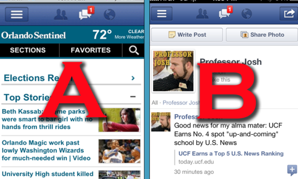
What difference do you see in Photo A versus Photo B?
Photo A and Photo B look very similar in the banner portion of the screen. The problem is that Photo A had me guessing I was in Facebook, while in fact, I was actually just surfing the web inside the Safari browser on my iPhone on the Orlando Sentinel’s mobile site. Photo B is actually inside the Facebook app on my iPhone on my own Facebook page with a single message notification. The Orlando Sentinel devised a banner advertisement that look identical to the Facebook banner for when you have a message notification. I’m guessing this was developing hoping to trick someone in click the advertisement.
I have three reasons why this disturbs me from a supposedly good regional newspaper:
#1 – This is the same tactics that spammers and phisher use to try to gain access to passwords, click on viruses, or just take you to terrible websites.
#2 – They probably don’t want other companies stealing their photos, icons, logos, or copy. Why do you need to steal an exact screen capture of the mobile Facebook app with a notification to trick people into a clicking banner ad link. I won’t what Mark Zuckerberg thinks of this tactic?
#3 – I wonder who else will be attending to utilize similar tactics to trick those not as familiar with their iOS to gain passwords for access to Facebook accounts.
I’m really hoping this was mistakenly granted approve in the online advertise division of the Orlando Sentinel and was removed promptly by someone with a little sense. I tried to find the similar ad by reloading my browser several times later in the day and could not find the same banner ad.
I did tweet the @orlandosentinel in the afternoon on Thursday but never got a response.
What’s up with the mobile banner ad on the @orlandosentinel mobile page that looks like the top of the mobile facebook screen?
— Joshua Murdock (@professorjosh) February 2, 2012
What do you think of this tactic?
Have you seen similar banner ads on mobile sites?
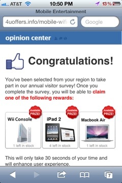
This is where the link takes you:
Update 2/20/12 – Tweet back from Orlando Sentinel.
@professorjosh Thank you for putting this together! I didn't see that on my phone, but I will forward this to our Mobile Manager.
— Orlando Sentinel (@orlandosentinel) February 21, 2012
Update 2/22/12 – Different banner ad taking you to Win iPad 2 spam site


I am surprised how close it actually looks to the real thing. I would expect something better from the OS. Did you click on the ad to see where it went?
I click but was taking me to shorten URL so I got off it off it quick. I went back later in the after but didn’t find the ad again.
That is just not cool, I thought the annoying ads that you have to skip over to reach many newspapers site were bad but this beats that.
Very annoying!
*sites
great post! Keep up the great work!
I’ve seen this for other sites, not just the Sentinel. I’m not sure how mobile banner ads work, but I don’t think this specific one is a conscious decision made by the site you were one. I don’t know if they pay a service that rotates them out, but I have definitely seen it even on games like Angry
Birds. It does seem way wrong
ProJosh,
These are old-school tactics of yesteryear. Making banners that look like Windows ‘alert’ boxes and the likes. It’s not a testament to fresh thinking nor progressive in anyway. Additionally, it speaks poorly to a brand that would require piggybacking a UI construct to increase “perceive” brand loyalty. If you’re brand is strong you must own your brand holistically – traditional, online, mobile/tablet and email.
These are dark days. Having read this, I debate my career choice of 20 years. How do I pull the trigger with my toe?
JusticeMitchell.com
Justice – Thanks for the great comment as an professional in the marketing field.
It was banners like this that cause the IAB to make standards for online banner ads. The Orlando Sentinel, or the mobile ad provider is contracts with, should agree to adhere to those same standards. My guess is that the OS does not see or approve every ad. You don’t even get to do that with Google Adsense, so sometimes crappy ads, especially when they’re targeted, slip through.
The online advertising industry should work to get this under control by publishing whitelists of agencies that agree to the standards, so everyone knows which ad providers are safe to use. Otherwise ad click-through rates will go down and then no one wins.
-John
John – great insight and you are right on the money. It’s a corporate thing but I think those with mobile apps should be more aware of what ads are going on their site. If the ad was clear cut on what it was your were clicking on, than this would most likely not be a problem.